10 Real-World Claude Artifacts Examples You Can Build Today
Quick Answer
Claude Artifacts lets you generate fully interactive web apps, dashboards, tools, and visualizations directly inside your Claude chat window. This article shows 10 practical examples you can build right now — from a sales calculator to a project kanban board — complete with the exact prompts to use and what the output looks like.
Introduction
When most people use Claude Artifacts, they generate a chart or a simple HTML page and call it a day. That’s like using a smartphone only for phone calls — you’re missing most of what it can do.
Claude Artifacts can build fully interactive web applications. Forms with validation. Dashboards with live charts. Tools that solve real problems. All inside your chat window, without opening another app.
I’ve collected 10 practical examples that go beyond demos. Each one is something you can prompt Claude to build in minutes, and each one solves a real problem. Here they are.
1. Interactive Sales Quote Calculator
What it does: A pricing tool where sales reps select products, adjust quantities, see instant pricing with discount tiers, and compare plans side by side.
Why it’s useful: Sales teams constantly send quotes. Instead of spreadsheets or back-and-forth with pricing sheets, this gives them a self-serve tool they can use in meetings or share with prospects.
The prompt: “Create a sales quote calculator with 3 product tiers (Basic $29/mo, Pro $79/mo, Enterprise $199/mo). Users can select quantities for each tier, see the subtotal, apply a discount percentage slider (0-30%), and see the final total update in real time. Add a comparison table below showing what each tier includes. Style it with a clean professional look — blue accents, white cards, smooth animations.”
What you get: A fully functional calculator with real-time price updates, discount slider, and comparison table — rendered as a live web page inside Claude.
2. Real-Time KPI Dashboard
What it does: A business dashboard showing key metrics with charts, filter controls, and the ability to simulate data updates.
Why it’s useful: Every team needs a dashboard. This is a template you can customize — swap the data source, change the metrics, adjust the colors — and have a working dashboard in minutes.
The prompt: “Build a KPI dashboard with 4 metric cards (Revenue $847K, Users 12,430, Conversion Rate 3.2%, Avg Order $64) and two charts below — a bar chart showing monthly revenue for the last 6 months and a line chart showing user growth. Add a date range filter at the top. Use Chart.js for the charts. Professional dark theme with gradient accents.”
What you get: A live dashboard with interactive charts powered by Chart.js, filterable by date range.
3. Data Cleaning Pipeline Visualizer
What it does: A step-by-step visual tool that shows how data moves through a cleaning pipeline — raw input, remove duplicates, standardize formats, handle missing values, validate, export.
Why it’s useful: Data cleaning is a core skill. This visualizer helps teams understand the pipeline and can be adapted to show actual ETL workflows.
The prompt: “Create a data pipeline visualization with 6 stages displayed as connected cards: Raw Input, Remove Duplicates, Standardize Formats, Handle Missing Values, Validate, Export. Each card should show example stats (e.g., “1,240 rows → 1,198 rows”). Use a horizontal flow layout with animated arrows between stages. Add a color gradient from red (raw) to green (clean). Clean modern design.”
What you get: An interactive pipeline diagram with animated connections and stage-specific details.
4. Budget vs Actuals Tracker
What it does: A financial tracking tool where users enter budgeted and actual amounts across categories and see variances calculated in real time with visual indicators.
Why it’s useful: Personal and small business budgeting is universal. This tool makes it easy to spot where spending is over or under budget at a glance.
The prompt: “Build a budget tracker with editable rows for categories (Rent, Utilities, Groceries, Transport, Entertainment, Savings). Each row has Budget, Actual, and Variance columns. Calculate variance automatically and color it green (under budget) or red (over budget). Add a total row at the bottom and a donut chart showing spending by category. Use the spreadsheet-style layout with inline editing.”
What you get: A working budget spreadsheet with inline editing, automatic variance calculation, and a visual chart breakdown.
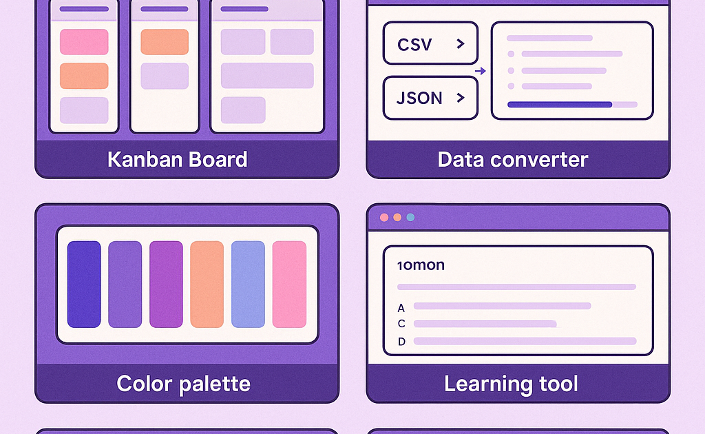
5. JSON-to-SQL Converter Tool
What it does: A developer utility where users paste JSON data and get equivalent SQL CREATE TABLE and INSERT statements generated automatically.
Why it’s useful: Developers frequently need to convert between data formats. This tool saves time and reduces errors compared to manual conversion.
The prompt: “Create a JSON-to-SQL converter with a textarea for input JSON and a read-only output area for generated SQL. Add a ‘Convert’ button. Infer column types from the JSON data (string, integer, float, boolean). Generate CREATE TABLE and INSERT statements. Add a ‘Copy SQL’ button. Keep the design minimal and functional with a dark code editor aesthetic.”
What you get: A fully functional developer tool with smart type inference and one-click copy.
6. Meeting Notes to Action Items
What it does: Paste meeting notes, get extracted action items organized by owner, priority, and due date in a clean table.
Why it’s useful: Meeting notes are useless without follow-up. This tool structures them into actionable items automatically.
The prompt: “Build a meeting notes to action items tool. Include a textarea for pasting notes, an ‘Extract Actions’ button, and a table that shows extracted items with columns: Action Item, Owner, Priority (High/Med/Low), Due Date. Add a manual add button and the ability to mark items as complete. Use card-based design with priority color coding. Keep it simple and fast.”
What you get: An action item management tool that structures unstructured notes into assignable tasks.
7. A/B Test Results Visualizer
What it does: Enter control and variant metrics (visitors, conversions), get statistical significance calculations, confidence intervals, and visual comparison charts.
Why it’s useful: Product managers and marketers run A/B tests constantly. This tool eliminates spreadsheet calculations and provides immediate visual feedback.
The prompt: “Create an A/B test results calculator. Input fields for Control and Variant: Visitors and Conversions. Calculate conversion rate for each, lift percentage, and statistical significance using a z-test. Show results with a comparison bar chart and a confidence interval visualization. Mark the result as ‘Significant’ or ‘Not Significant’ with appropriate coloring. Clean analytical design.”
What you get: A statistical analysis tool with visual outputs that shows whether your test results are meaningful.
8. Learning Flashcards App
What it does: An interactive study tool where users create decks of flashcards, flip through them, and track which ones they’ve mastered.
Why it’s useful: Spaced repetition works. This gives students and lifelong learners a simple flashcard system with progress tracking.
The prompt: “Build a flashcard study app. Users can create a deck with a title and add cards (front and back text). Study mode shows one card at a time — click to flip. Track which cards the user got right or wrong. Show progress (X of Y mastered). Add the ability to restart the deck. Use card flip animations. Clean, friendly design with rounded corners and soft colors.”
What you get: A complete study tool with deck management and progress tracking.
9. Team Standup Board (Kanban Style)
What it does: A simple kanban board with columns for To Do, In Progress, and Done. Team members add cards, move them between columns, and track weekly progress.
Why it’s useful: Remote teams need lightweight task tracking. This is simpler than setting up Jira or Trello for a small team.
The prompt: “Create a kanban board with 3 columns: To Do, In Progress, Done. Each column has cards that can be dragged between columns. Each card has a title, assignee, and priority label. Add a form to create new cards with title input, assignee dropdown (Alice, Bob, Charlie), and priority selector (High/Med/Low). Color code by priority. Use local storage to persist board state. Clean, modern design.”
What you get: A functional kanban board with drag-and-drop, priority color coding, and persistent data.
10. CSS Component Library Preview
What it does: An interactive gallery of reusable CSS components — buttons, cards, modals, forms, navigation bars — all themeable and previewable in one page.
Why it’s useful: Designers and developers can experiment with component styles, pick colors, and see how changes affect all components at once.
The prompt: “Build a CSS component library preview page. Show sections for: Buttons (primary, secondary, outline, ghost), Cards (with image placeholder, text, and action button), Form elements (inputs, selects, checkboxes, toggles), and a Modal example. Include a theme customizer at the top with color pickers for primary and secondary colors — changing them updates all components live. Clean, polished design.”
What you get: A living style guide with real-time theming — useful for web designers and developers.
How to Get Started Building These
Each example above is designed to work as a single HTML artifact. Copy the prompt into Claude, let it generate the artifact, and you’ll see the result immediately. Here’s a quick workflow:
- Open Claude and start a new conversation
- Paste the exact prompt (or customize it)
- Claude generates the artifact — view it right in the chat
- Iterate by asking for specific changes
- Download the source or share the artifact link
For best results, include the output format (“Create an HTML file with…”) and be specific about what you want. The more detail in your prompt, the better the result.
Tips for Great Artifact Prompts
- Specify the format: Start with “Create an HTML file…” or “Build a web page…”
- Include design preferences: Colors, layout, dark/light theme
- List all features: Every button, input, and interaction you want
- Add constraints: “No external dependencies” or “Must work offline”
- Iterate in rounds: Build the basics first, then add polish
Frequently Asked Questions
Q: Do I need to know how to code to use these?
A: No. Claude writes all the code. You describe what you want in plain English, and Claude generates the artifact. Basic prompting skills are enough.
Q: Can I save and share these artifacts?
A: Yes. Claude provides a share link for each artifact. You can also download the source HTML and host it anywhere.
Q: Are these artifacts free to create?
A: Claude Artifacts are available to all Claude users. Free tier has usage limits; Pro and Team subscribers get higher limits.
Q: Can I modify these after they’re generated?
A: Yes. You can ask Claude to make changes — adjust colors, add features, fix layout. Each iteration updates the artifact in real time.
Q: Do these work on mobile?
A: Artifacts are responsive by default if you ask Claude to make them so. Include “responsive design” in your prompt for mobile-friendly output.
Conclusion
Claude Artifacts is far more powerful than most people realize. These 10 examples show that with the right prompts, you can build genuine tools — not just demos, but things you’ll actually use.
The key is specificity. The more detail you give Claude about what you want, the better the artifact. Start with the prompts above, customize them for your needs, and you’ll have a library of useful tools built entirely through conversation.